Blood Bikes East Logo Design / Rebrand Project Case Study
by Franco De Bonisin General Marketing 0 Comment(s)
Overview:
This Rebrand / Logo Design case study provides information on the background to and implementation of a review of the current Blood Bike East branding and the subsequent implementation of a new logo and identity for this high profile charity.
Background:
In 2012 a small group of individuals led by Pat McCabe began working with hospitals in the Leinster region of Ireland (for those not familiar with Irish geography, that covers the eastern region of Ireland encompassing Dublin and surrounding counties). All volunteers and all advanced motorcycle riders, ‘Blood Bike East’ was formed and began transporting blood, blood products, breast milk, medical products, samples for testing, test results and even transplant related tissue between hospitals for free.
If Blood Bikes East did not exist, every time an item would need to go from one hospital to another, it would have to pay for a taxi, courier or ask the ambulance service to take it. BBE therefore saves the hospitals vital funds that can be used to help more patients.
However, like many start-up charities, the focus in the early days was on the logistics and getting the support services off the ground. Additionally, money is always tight. Therefore, the focus was not initially on getting the branding perfect .
The Requirement:
Today the charity is on track to handle 3,000 call-outs in 2015, with the vast majority being between dublin hospitals. They also link up with other Blood Bike organisations in the south and west of Ireland to transfer medical packages cross-country. In order to grow and add additional capacity and service more hospitals, the charity requires corporate funding and better recognition of the brand.
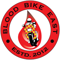
Having joined the group as a volunteer rider, the committee became aware of my marketing background and approached me to discuss the challenges they face and the issues they felt existed with the branding and logo (which they admitted had been designed in minutes). The logo at the time was:
They asked me to review the branding and report back with some insights. Following further discussions, a number of key findings were highlighted:
- The text is not easily legible, especially when small, but even at quite large sizes. This is due to the text being black on a red background; never a good combination in the design world.
- There are too many overlapping elements making the logo complex to process.
- The bike image looks like a racing related element and not 100% appropriate to the role of transporting blood.
- The logo lacks personality/emotion/a message
- The font is dated.
With this in mind, it was felt that a new logo would refresh the entire brand and reinvigorate the efforts around gaining more corporate sponsorship.
Additionally a discussion was had around the benefits of the name remaining singular (Blood Bike East) rather than it changing to plural (Blood Bikes East).
Finally, a discussion was had about the lack of a tag line that defined the group and so a desire to have a strong tagline was expressed.
The Solution:
Blood Bike East vs. Blood Bikes East
Some simple research highlighted that most of the well established blood biker groups in the UK used the plural. Further keyword volume research also highlighted that in Ireland and the UK, search volumes for ‘Blood Bikes’ was >4X the search volume for ‘Blood Bike’ at 720 per month vs. 140 per month. This highlighted that the general public are more inclined to think of the organisation in the plural rather than the singular. Finally, using the plural reflected the larger organisation that BBE is today, rather than the singular portraying a small charity with a single bike. It was therefore decided that the name would change to the plural.
Tagline
Following some thought and research, the following tagline was developed and presented to the committee and wider volunteer group:
RIDERS FOR LIFE
The phrase itself has an intentional double meaning. Firstly it points out that all rider volunteers are life-long and therefore experienced riders. Secondly it highlights that what the charity does is ride to help people stay alive.
A secondary benefit of the tagline is that it can be easily used as a hashtag (#RidersForLife) in future social campaigns.
Logo Briefing
A briefing meeting was held and as well as covering the points raised in the Background section, a strong desire to have a more distinctive graphical element to the logo was expressed.
Additionally as discussion progressed, the word ‘angel’ kept coming up as a number of people have referred to the volunteers as angels because of what they do for free.
First Draft Of The Logo
Using all this feedback I created a rough draft of a new logo to use as a concept for discussion. It looked like this:
This ticked a number of boxes, but now it was time to bring in real graphic designers!
Fortunately, BBE has a diverse volunteer group and one such volunteer (Jonathan Foley) is a graphic designer with expertise in brand design. With the committee’s and wider volunteer group’s feedback on the draft, Jonathan and I set about turning the draft into a final logo. It was determined that:
- The font needed to be even more modern
- The colour needed to be a little brighter
- We needed to eradicate the gradient on the wings for easier printing at all resolutions
Second Draft Of The Logo
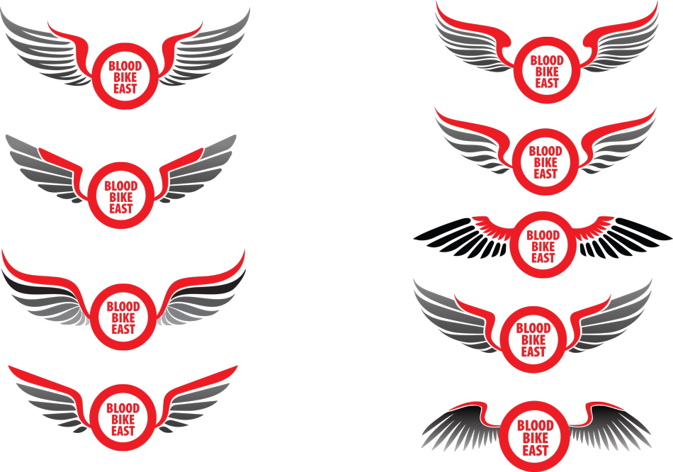
Using all this feedback, Jonathan delivered a number of logo options as shown below. His approach was to focus on the core elements first (the wings, the main colour and the main text):
In reviewing these options it became clear very quickly that the best option was the third down in the right column for the following reasons:
- The wing configuration looks like it is a soaring bird rather than flapping, preening or aggressive
- It uses no gradients – just red and black
- It is the simplest wing design with less stylistic/abstract elements of feathers
- It is simply the most appealing/friendly rather than looking like batman, etc.
- It is the only one with a good and thick connector to the circle, the rest look a bit weak and flimsy
With this feedback Jonathan set about finalising the logo.
Final Version Of The Logo
The final version encompasses the chosen wing style, plus the tagline and the date the charity was established:
Summary:
I am delighted to be associated with such a worthwhile cause and to have been able to work on delivering the new brand, tagline and logo. The task was made infinitely easier by an engaged team that understood the challenges they faced and by Jonathan’s excellent and professional support.
The final logo is clean, simple and has purpose. I am sure it will serve BBE well for years to come. Now comes the task of applying this new logo to all the charities elements including a new website…but that comes next.
Please consider donating to this amazing cause. Maintaining the bikes and paying for fuel, insurance, maintenance, tyres, brakes, etc. is not cheap and although we provide the service for free, our service has a cost to us. You can donate at www.bloodbikeeast.ie
brand identity, logo design, rebrand


LEAVE A REPLY
Your email address will not be published. Required fields are marked*